
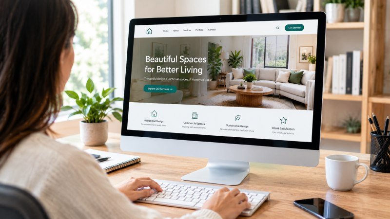
The Five-Second Judgment Problem
Most people assume a homepage just needs to look clean and load fast, and that visitors will naturally find their way to what they need if the design is attractive enough. That belief has been repeated so often in marketing circles that it’s treated as settled fact. But a homepage isn’t a brochure sitting on a coffee table waiting to be admired; it’s a decision point, and visitors make judgments about whether to stay or leave within a handful of seconds.
The real issue is that homepage optimization isn’t primarily a design exercise at all. It’s closer to a sorting problem. Every visitor arrives with a different intent, a different level of familiarity with your business, and a different amount of patience. A homepage that tries to please everyone with a single hero image and a generic tagline usually ends up serving no one particularly well, because it treats a crowd of distinct needs as if they were one audience.
When a homepage fails to answer the basic questions a visitor has in mind, people don’t wait around to figure out the rest. They leave, and they rarely come back to give a second impression a chance. That’s why the structure beneath the surface, not just the visual polish, determines whether a homepage actually performs.
There’s also a timing element that gets ignored. A visitor who lands on a homepage from a search result has already formed an expectation based on the words that brought them there. If the page doesn’t echo that expectation within the first screen, confusion sets in before the visitor even reads a full sentence. This mismatch happens constantly on business websites that were designed around a general idea of the brand rather than around the specific questions a stranger would ask when arriving for the first time.
Matching Local Expectations With Local Proof
One part of homepage optimization that gets overlooked is relevance to place. A visitor searching for services in a specific region wants quick confirmation that the business actually serves their area, not a vague promise buried three clicks deep. Homepages that lead with broad, location-agnostic language often lose local visitors before those visitors even scroll, simply because nothing on the page tells them they’re in the right spot.
This is where specificity earns its keep. A design firm that clearly identifies its working region, for example presenting itself as a Boise interior designer rather than a generic national brand, gives visitors an immediate signal that they’re looking at something built for their situation rather than a one-size-fits-all pitch. That kind of clarity reduces hesitation, and hesitation is usually what kills conversions on a homepage before any other factor gets the chance.
Physical context matters in other industries too, not just design services. Construction and building projects depend on documented standards and verified practices, which is part of why NIST building and construction research is often cited when people want to understand how materials, methods, and safety requirements are evaluated at a technical level. A homepage representing any physically grounded service benefits from this same instinct: show the visitor that real standards and real local presence are behind the words on the screen, not just stock photography and borrowed phrasing.
Smaller businesses sometimes assume this kind of specificity will narrow their appeal, as if naming a region or a craft too plainly might scare off visitors from elsewhere. In practice, the opposite tends to happen. Visitors who aren’t in the stated region simply move along, which saves everyone time, while visitors who are exactly the right fit feel like the page was written with them in mind. That sense of recognition, however small, often does more to keep someone reading than any clever headline could manage on its own.